
In visual communication, there is a common assumption that as long as all necessary information is present, the message will be successfully delivered. Designers, marketers, and content creators often focus on completeness, ensuring that every required detail is included. However, real-world observation consistently shows that completeness alone does not guarantee understanding.
Introduction: Why Messages Fail Even When Information Is Complete
Many posters, banners, presentations, and digital graphics contain accurate and comprehensive information, yet they fail to communicate effectively. Viewers overlook key details, misunderstand the message, or disengage entirely. This failure is rarely caused by weak content. Instead, it is usually the result of poor visual structure.
This article explores how a single design, using the same content, can perform dramatically better when layout, hierarchy, spacing, and flow are improved. No new text is added, and no information is removed. The transformation relies solely on how information is organized and presented, demonstrating that design structure plays a decisive role in communication success.
Understanding the Role of Design in Communication
Design is often misunderstood as decoration or visual enhancement. In reality, design functions as a system for organizing information in a way that supports understanding. Every design decision placement, spacing, size, alignment, and contrast affects how viewers interpret and prioritize information.
Effective design answers three fundamental questions almost instantly:
- What is this about?
- What information is most important?
- What should the viewer remember or act upon?
If these questions are not answered within a few seconds, the viewer’s attention is lost. In fast-paced environments such as social media, public spaces, or digital platforms, this loss of attention can render even the most informative content ineffective.
By improving structure alone, design can guide the viewer naturally, reduce confusion, and increase engagement without changing the message itself.
Project Overview: Same Message, Two Different Outcomes
The redesign process examined here involved a promotional poster that already contained all required information. The content was accurate, relevant, and complete. However, the original design struggled to communicate clearly due to structural weaknesses.The redesign followed strict constraints:
- No text was rewritten
- No information was added or removed
- No new visuals were introduced
The only changes involved:
- Layout arrangement
- Spacing between elements
- Alignment consistency
- Visual hierarchy
- Grouping of related content
Identifying the Core Issue: Information Without Guidance
The central problem with the original design was not the absence of information, but the absence of guidance. Viewers were presented with content, but the design did not tell them how to consume it. Several issues contributed to this problem:
- The viewer’s eye had no clear starting point.
- Multiple elements competed for attention
- Important details were visually indistinguishable from secondary information
- Dense text areas discouraged scanning
- Sections lacked clear separation
As a result, viewers had to work harder to understand the message. In visual communication, any design that demands effort risks losing its audience.
Why Visual Flow Matters in Poster Design
Visual flow refers to the path a viewer’s eyes follow when interacting with a design. Strong visual flow leads the viewer smoothly from one piece of information to the next in a logical sequence.
Poor visual flow results in:
- Confusion about where to look first
- Missed or overlooked information
- Reduced comprehension
- Mental fatigue
- Lower engagement
Strong visual flow, on the other hand:
- Speeds up understanding
- Improves readability
- Increases information retention
- Creates a more comfortable viewing experience
The redesign placed strong emphasis on correcting flow-related issues by guiding attention deliberately and predictably.
Detailed Analysis of the Original Design
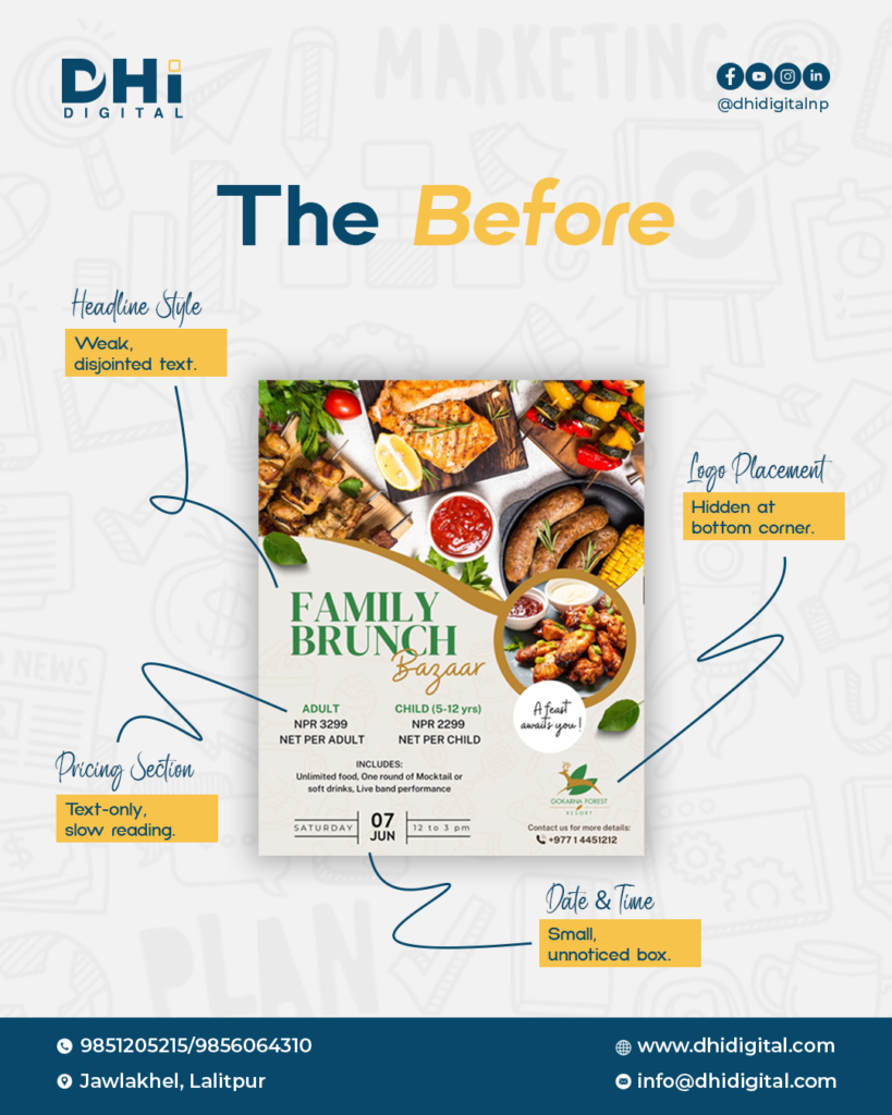
- Lack of Hierarchy
In the original version, all elements appeared equally important. Without contrast in size or placement, the viewer could not easily identify the primary message.
- Overcrowded Sections
Certain areas contained too much information packed closely together. This created visual noise and discouraged scanning.
- Ineffective Use of Space
Whitespace was inconsistent. Some areas felt cramped while others felt disconnected, reducing overall balance.
- Weak Content Grouping
Related information was scattered instead of grouped logically, forcing viewers to search for connections.
- Branding Visibility Challenges
Brand elements were present but did not stand out clearly, reducing recognition and recall.
Objectives of the Redesign
The redesign was guided by clear objectives aimed at improving communication efficiency:
- Establish a strong and clear visual hierarchy
- Create an obvious entry point for the viewer
- Improve readability at a glance
- Reduce cognitive load
- Organize information logically
- Enhance overall balance and professionalism
These objectives ensured that every design decision served a functional purpose.
Redesign Approach: Improving Structure Without Changing Content
The redesign followed a disciplined, principle-driven approach. All original content was preserved exactly as it was. No new imagery or decorative elements were added. Improvements were achieved solely through:
- Rearranging elements
- Adjusting spacing
- Refining alignment
- Strengthening contrast
- Clarifying hierarchy
This approach ensured that any improvement in communication could be directly attributed to better design structure.
Key Structural Improvements
- Establishing a Clear Entry Point
The redesigned layout introduces a dominant focal point that immediately communicates the main message. This gives the viewer a clear starting position.
- Strengthening Visual Hierarchy
Differences in size, font weight, and placement clearly distinguish primary, secondary, and supporting information. The viewer understands what to read first without effort.
- Logical Content Grouping
Related elements are grouped together visually, reducing the need for mental interpretation. This makes the design easier to scan and understand.
- Balanced and Intentional Spacing
Whitespace is used deliberately to separate sections, improve readability, and reduce clutter. Space becomes an active design tool rather than empty filler.
- Consistent Alignment
Elements align along a clear structure, creating order and stability. Consistent alignment improves professionalism and visual trust.
- Improved Brand Integration
Branding is positioned clearly and consistently, ensuring visibility without distracting from the core message.
The Redesigned Experience: Clarity Through Structure
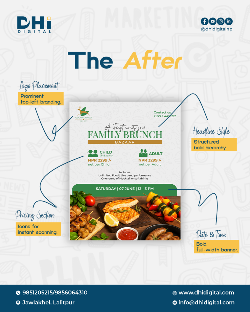
The redesigned version offers a significantly improved viewing experience. Viewers can now:
- Understand the purpose of the design within seconds
- Identify key information immediately
- Follow a natural and predictable reading path
- Engage without feeling overwhelmed
The overall experience feels calmer, cleaner, and more intentional.
Before and After: A Shift in User Experience
Before redesign
- Viewers needed time to understand the message
- Important details were easy to overlook
- The layout felt cluttered and demanding
- The design required effort to process
After redesign
- The message is instantly clear
- Key details stand out naturally
- The layout feels organized and balanced
- The design supports effortless scanning
This contrast highlights how structure directly influences perception and understanding.
Cognitive Principles Behind Better Design Flow
Human attention is limited. Designs that demand excessive mental processing are often ignored. The redesigned layout aligns with cognitive principles by:
- Reducing visual noise
- Limiting the number of elements competing for attention
- Presenting information sequentially
- Supporting natural reading patterns
By working with human cognition rather than against it, the design becomes more accessible and effective.
Practical Insights for Designers and Communicators
This analysis offers several practical lessons:
- Information must be guided, not just displayed
- Hierarchy determines clarity
- Whitespace improves comprehension
- Structure shapes perception
- The same content can perform very differently based on layout
These insights apply across posters, websites, presentations, dashboards, and digital interfaces.
Broader Applications of This Design Approach
The principles demonstrated here extend beyond posters. They are equally relevant to:
- Marketing and advertising materials
- Social media graphics
- Landing pages
- Reports and presentations
- Educational and instructional content
Conclusion: Design as a System for Understanding
This detailed analysis reinforces a fundamental truth: design is not about decoration, but about understanding. By improving hierarchy, spacing, alignment, and visual flow, the redesigned poster communicates the same content more clearly, efficiently, and professionally.Effective communication is not about saying more. It is about helping the audience understand more, through thoughtful and intentional design structure.For further information on design strategy, visual communication, and structured creative solutions, please visit DHi Digital.